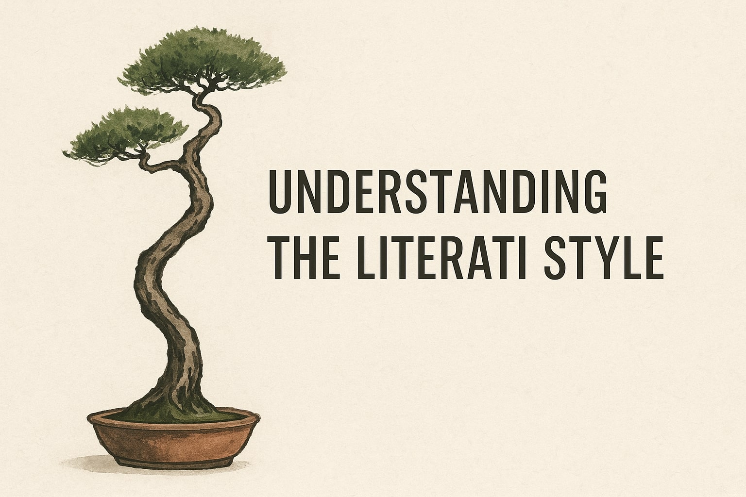
The Literati style is one of the most poetic and expressive forms in the world of bonsai. Known for its graceful curves, dramatic movement and intentional minimalism, this style captures the resilience of trees that have survived harsh conditions in nature.
The Literati style celebrates character over perfection, focusing on a tall, slender trunk with sparse foliage that tells a story of endurance and timeless beauty. It is a favourite among artists who appreciate bonsai as a form of living philosophy rather than simple ornamentation.
Table of Contents
What defines the Literati style
The literati style is defined by its elegant minimalism, tall proportions and expressive movement. Unlike more compact or heavily branched bonsai forms, the literati style relies on a long, slender trunk that twists or curves in a way that feels natural and unforced. This trunk is the main focus of the tree, while the foliage is intentionally sparse and placed high up, allowing the viewer to appreciate the tree’s shape without distraction.
Another defining feature of the literati bonsai style is its emphasis on individuality. No two trees shaped this way look alike, because each one reflects the idea of a tree that has survived difficult conditions such as strong winds, poor soil or limited sunlight. The result is a bonsai that embodies character, resilience and artistic expression rather than strict symmetry or density.
Natural inspiration behind the Literati style
The natural inspiration behind the Literati style comes from some of the most dramatic and poetic scenes found in untouched landscapes. In nature, these trees often grow in places where survival is a daily struggle. You will find them clinging to the edges of cliffs, rooted between stones on mountain passes, or standing alone in windswept grasslands where harsh conditions shape them over decades. Because the environment restricts their growth, these trees develop long, stretched trunks that twist toward the light in elegant, almost calligraphic movements.
In mountain regions, a literati-like tree may grow with only a thin layer of soil beneath it. Strong winds push it sideways, snow loads pull it downward and competing vegetation forces it to grow taller than normal. Every curve, scar and lean of the trunk tells a story of endurance. This natural storytelling is one of the reasons the Literati style appeals so deeply to bonsai artists. It captures the beauty of imperfection and the quiet dignity of a tree that has survived trials many would not endure.
In dense forests, the story is different yet equally compelling. Trees crowded by taller species receive very little sunlight. Instead of spreading wide, they shoot upward, developing a narrow, elongated trunk with very few branches along the way. Only once they break through the canopy do they produce a small crown of foliage. This growth pattern forms the foundation of the Literati style — a tall, minimalistic design with the foliage sitting high and light, almost as an afterthought to the trunk.
Artists also draw inspiration from traditional Chinese ink paintings, where solitary, sweeping trees often appear on mountainsides. These paintings do not aim for botanical accuracy. Instead, they capture emotion, atmosphere and movement with a few simple, flowing brushstrokes. The Literati style mirrors this philosophy. Every bend, space and silhouette is intentional, designed to evoke a feeling rather than a perfect form.
In essence, the Literati style is a tribute to trees shaped not by gardeners, but by nature itself. It celebrates the raw beauty of survival, the poetry of struggle and the quiet wisdom carried by trees that grow in places most others cannot.
Trunk movement and taper characteristics
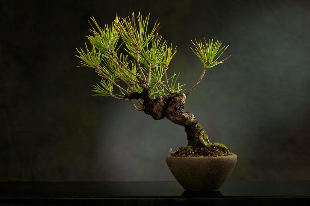
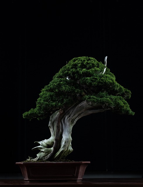
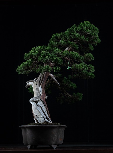
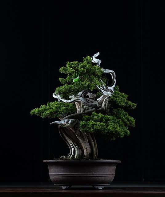
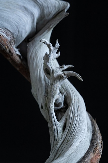
The bonsai trunk is the heart and soul of the Literati style, and its movement and taper are what give this form its unmistakable elegance. Unlike other bonsai styles that prioritise balance, symmetry or dense branching, the literati trunk is intentionally expressive. It often features long, flowing lines with dramatic curves that feel spontaneous rather than engineered. The goal is to create a trunk that appears shaped by wind, time and natural adversity, not by the hand of the artist.
A key characteristic is the exaggerated height relative to the overall size of the tree. Literati trunks are typically much taller and thinner than those in other bonsai styles, sometimes rising in a single, fluid line before forming their sparse crown. This elongated appearance emphasises grace, fragility and movement, giving the tree a sense of poetry and quiet strength.
The taper of the trunk is also unique in the literati style. Most bonsai styles aim for a strong, consistent taper from thick base to slender apex, but the literati style treats taper more delicately. The base is often only slightly thicker than the upper sections, resulting in a trunk that maintains a slender, elegant profile. The taper may be subtle, even barely noticeable, but it must still be present to avoid an unnatural, stick-like appearance. The best literati trees achieve what artists call refined thinness: lean but not weak, delicate yet confident.
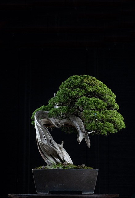
Movement is perhaps the most cherished element. Literati trunks rarely grow straight. Instead, they bend, twist or lean in visually interesting ways that mimic trees shaped by difficult environments. These curves are not meant to look chaotic or overworked. Instead, they should feel like the natural reaction of a tree seeking light, bending away from cliff edges or yielding to years of strong wind. Good literati movement has rhythm. It guides the viewer’s eye upward in a single, continuous journey, almost like following a brushstroke in a calligraphy painting.
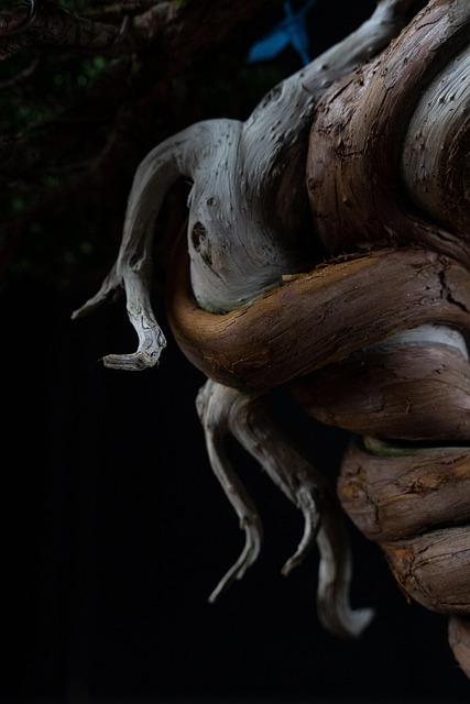
Another important feature is intentional unevenness. In traditional bonsai, too much unevenness can be considered a flaw, but in literati design, slight irregularities enhance the storytelling. A sudden change in angle, a dramatic lean or even a trunk scar can add depth and character when incorporated thoughtfully. These imperfections help convey the narrative of a tree that has endured hardship.
Finally, artists often leave sections of the trunk exposed by using minimal foliage. This highlights the movement and ensures the trunk remains the star of the design. Shari or jin (deadwood techniques) may sometimes be applied, but only sparingly. Overuse would distract from the purity and simplicity that define the literati aesthetic.
In the end, trunk movement and taper in the Literati style are all about expression. They reflect the resilience, struggle and beauty of trees shaped by nature’s toughest challenges, captured in one long, graceful, living line.
Branch placement and foliage design
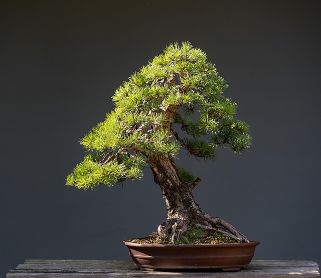
Branch placement and foliage design in the Literati style follow a philosophy very different from most other bonsai forms. Where traditional bonsai aims for layered, structured branching that creates balance and fullness, the literati approach intentionally avoids heavy ramification. Instead, it focuses on minimalism, negative space and the expressive storytelling created by just a few carefully placed branches.
In most literati trees, the lower trunk is deliberately left bare. There are either no branches at all or only the faintest hints of old growth that was lost long ago. This open trunk line is essential because it allows the viewer to appreciate the sweeping movement, subtle taper and elegant curves without distraction. The emptiness is part of the art. It gives the tree a sense of age, endurance and quiet dignity.
Branches usually begin very high on the trunk, often in the upper third of the tree or even higher. This mirrors the growth habits of real trees that have stretched upward for light in dense forests or harsh mountain regions. High branches add to the sense of dramatic height and make the crown appear as a small, delicate cluster hovering at the very top of the design.
Because literati bonsai emphasise simplicity, the tree typically has very few branches, and each one is placed with intention. A single branch may create the entire silhouette on one side, or two branches may form a subtle asymmetry that adds natural tension. These branches should never appear overly thick or heavy. Thin, refined lines that echo the trunk’s delicate character are ideal.
Foliage design follows the same principles of restraint. Rather than forming compact pads or dense canopies, literati foliage should be light, airy and irregular. It often appears wispy or slightly windswept, hinting at nature’s influence rather than a gardener’s heavy hand. The leaves or needles are allowed to express themselves freely, creating a sense of movement and openness.
Negative space plays a crucial role. In the Literati style, the spaces between branches and foliage are just as important as the greenery itself. These empty areas guide the viewer’s eyes along the trunk, highlight the dramatic curves and contribute to the composition’s overall sense of balance. Skilled artists know how to shape the tree so that every leaf has room to breathe.
The crown of a literati bonsai is often small and understated. It may lean to one side, sit slightly off-center or appear incomplete, echoing the unpredictable beauty of nature. This understated top section avoids overpowering the trunk and helps maintain the tall, slender impression that is central to the style.
Overall, branch placement and foliage design in the Literati style prioritise elegance, lightness and storytelling. Every branch, leaf and empty space contributes to a living artwork that feels effortless yet conveys decades of endurance and quiet beauty.
Choosing the right species for Literati style
Choosing the right species for the Literati style is essential, because not every tree responds well to the dramatic height, sparse foliage and expressive movement that define this artistic form. The best species are those that naturally grow tall and slender, tolerate minimal branching and adapt well to shaping techniques that emphasise elegance over density.
Conifers are among the most popular choices for the Literati style, with Junipers leading the way. Their flexible branches, fine foliage and natural tendency to develop twisting, expressive trunks make them ideal candidates. Junipers also respond exceptionally well to deadwood techniques, which can be used sparingly in literati to enhance character without overwhelming the composition. Pines are another excellent option, especially species with long needles and upright growth patterns. Their rugged bark, strong silhouettes and ability to produce sparse, airy foliage work beautifully with the literati aesthetic.
Deciduous trees can also be used, although they require a different approach. Chinese elms, maples and zelkovas can develop elegant, slender trunks and fine branching, but they must be managed carefully to avoid looking too busy or leafy. Their foliage tends to fill out quickly, so regular pruning and thoughtful branch selection are essential to maintain the open, minimalist design that defines the Literati style. When done well, deciduous literati trees create a delicate and graceful winter silhouette that is especially captivating.
Certain species naturally embody the literati spirit because of their growth habits in the wild. Olives, for example, often grow from rocky crevices with minimal soil, resulting in thin, twisting trunks that lend themselves perfectly to this style. Their small leaves and rugged bark add age and personality. Wattles, wild olives, and some native African species can also work beautifully if they naturally develop long, expressive lines and tolerate sparse foliage.
The most important factor when choosing a species is character. Literati bonsai thrive on individuality, so a tree with an unusual bend, a naturally slender trunk or a unique growing pattern is a strong candidate. Pre-bonsai material that might seem awkward or unsuitable for traditional styles often becomes the perfect foundation for literati. What matters is not uniformity but personality.
Ultimately, the right species for the Literati style is one that can grow with restraint, accept expressive shaping and display the poetic simplicity that defines this form. Whether you choose a sinewy juniper, a graceful pine or a delicate deciduous tree, the species should support the artistic vision and help tell the story of a tree shaped by time, adversity and nature’s quiet touch.
Creating balance through negative space
Creating balance through negative space is one of the defining artistic choices in the Literati style. Instead of relying on dense foliage or multiple branches, literati bonsai use open areas to emphasise the trunk’s graceful movement and natural character. These empty spaces are intentional, giving the composition a feeling of lightness and inviting the eye to follow the tree’s silhouette without distraction.
Negative space also prevents the small crown of foliage from appearing heavy. By allowing air and openness around the branches, the design maintains elegance and avoids visual clutter. In the Literati style, what you choose not to include is just as important as what you shape, and this balance between form and emptiness is what gives the style its quiet, poetic charm.
Pot selection for Literati bonsai
Pot selection for the Literati style plays a major role in completing the overall aesthetic. Because the tree itself is tall, slender and intentionally minimal, the pot should never overpower the design. Instead, it should act as a subtle foundation that supports the delicate visual balance. Literati bonsai traditionally use small, shallow pots that emphasise the tree’s dramatic height and reinforce the feeling of lightness. A deeper or more ornate container would distract from the simplicity and elegance the style is known for.
The shape of the pot also matters. Round, oval or slightly irregular pots are often preferred, as they echo the natural, free-flowing movement of the trunk. Rectangular pots can sometimes feel too rigid or formal for the expressive curves of literati, although they can work if chosen carefully. The key is harmony. The pot should complement the movement of the tree without creating tension or visual heaviness. In many cases, an understated pot allows the trunk’s storytelling to take centre stage.
Colour choice is equally important. Pots in muted tones such as soft browns, greys, creams or earth-inspired glazes work best, as they blend gently with the natural tones of bark and soil. Bright or glossy colours would compete with the minimalist style and disrupt the quiet feeling of age and resilience that literati aims to convey. Ultimately, the right pot should feel almost invisible at first glance, revealing its importance only upon closer appreciation. It anchors the tree while preserving the illusion of effortless elegance that defines the Literati style.
Common mistakes when shaping the Literati style
Shaping a Literati style bonsai requires restraint, confidence and a good understanding of natural movement. Because the style values minimalism and expression over structure, beginners often make choices that disrupt the tree’s elegance. Here are some common mistakes to avoid:
- Adding too many branches, which destroys the minimalist silhouette
- Allowing foliage to become dense instead of keeping it light and airy
- Making the trunk too straight or too symmetrical
- Creating curves that look forced instead of natural
- Using a pot that is too large, deep or visually heavy
- Overusing deadwood techniques, making the design appear busy
- Ignoring negative space, which results in cluttered composition
- Choosing a species that naturally grows too full or compact
- Placing foliage too low on the trunk instead of near the apex
- Trying to fix every imperfection rather than embracing natural character
Why the Literati style appeals to advanced artists
The Literati style appeals strongly to advanced artists because it demands a deeper understanding of bonsai philosophy rather than just technical skill. Unlike more structured styles that follow clear rules, literati challenges the artist to express emotion, movement and character using the bare minimum. It requires confidence in simplicity, patience in refinement and the ability to recognise beauty in what is unusual or imperfect.
Many seasoned artists are drawn to this style because it mirrors the freedom of traditional ink paintings, where a single stroke can convey years of struggle or survival. In essence, the Literati style is not only a bonsai form but a poetic statement, making it a rewarding pursuit for those who appreciate subtlety, nuance and artistic storytelling.